5 UX considerations for your navigation menu

Your navigation is the bread and butter of your eCommerce store. If your users are not able to navigate your site to achieve their goal (which is likely to find and buy a product) then your site is unlikely to convert, and may lead users to move to a competitor site. 

There are many aspects to good site navigation, from a clear site structure to a functioning search feature. But a key aspect that doesn’t always get the attention it deserves is your navigation menu. A weak or inaccessible navigation menu will be the downfall of your site. But fear not, by following these 5 considerations, you can ensure that your navigation menu is functional, optimised, and accessible to all. 

Follow industry patterns

Often breaking the mould and innovating are key steps to standing out in cramped markets. However, when it comes to digital and particularly eCommerce, straying from industry standards can sometimes be a downfall. Often new and innovative patterns in eCommerce can result in an inaccessible solution if not tested rigorously, and when it comes to businesses with vast quantities of products on offer, straying away from standard practices in eCommerce can end badly. 

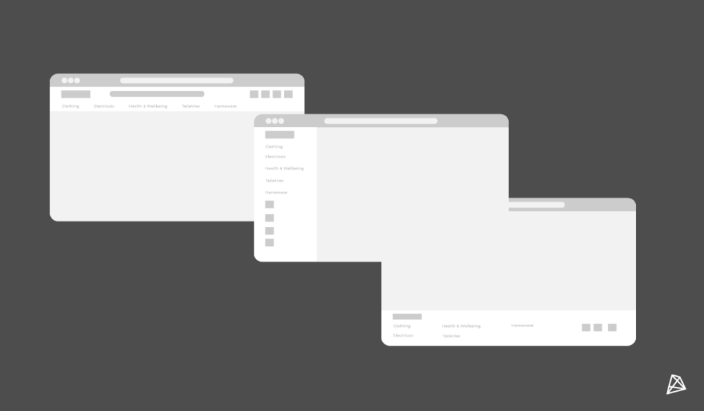
When it comes to site navigation, users have come to expect to find it in certain locations, eg. the very top of the screen, on the left side, on-page navigation or for apps/mobile a sticky bar on the bottom of the screen. When you stray from these standard locations you are running the risk of complicating the journey for your users, unless you have insights and evidence from user research to back up this change in pattern.

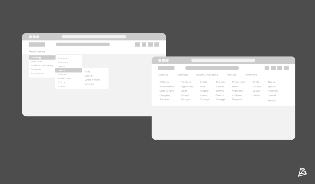
Move to a megamenu on desktop

Regular dropdown menus are typically the default with out-of-the-box templates and designs. However, research has shown that mega menus provide a superior experience for users compared to a simple dropdown menu. Why? Well mainly because a mega menu showcases everything at a glance and at once, including some subcategories. In contrast, a simple dropdown list can be long and require scrolling for all choices to be viewed. A mega menu also provide greater flexibility for your business, allowing you to include imagery, and links to content so that users get greater value from their visit. They also allow for better grouping and organisation of content as you can showcase up to various levels of navigation.

Display what the users want

When it comes to your navigation menu categories or sections, what is displayed plays an important role in how effective it is for your users. This depends on a variety of factors such as the quantity or complexity of your products and website, but a basic rule of not making your users search too hard for popular categories is a good principle to start with. Placing your most popular or important links at the beginning and end of the list will ensure they are easy to access and most visible, as these are the first and last things your users will see and thus will have a greater impact. 

If you are unsure of what these categories are, a card sorting exercise combined with some analytical data from your site will help you align your navigation to users’ expectations.

Don’t leave the user in the dark

Websites can be confusing places sometimes, especially when you have multiple sections, categories, and content types. Often users can find themselves down various rabbit holes with no clear way of returning to their start point, and if that start point was a product page then it could potentially cost your business a conversion. So to avoid this, and to prevent any confusion for your users, here are some ways you can keep your users informed:

  • Tab titles – by using clear titles for your tabs users can instantly recognise where they are.
  • Human-Readable URLs – an often overlooked part, URLs are a great and easy way to show your users where they are, it’s like a default breadcrumb and is very helpful if your site has page links within page links.
  • Breadcrumbs – as mentioned above, breadcrumbs are great for quickly and clearly informing the user where they are on your site, and how they have navigated there.
  • Descriptive headings – be sure to make headings as clear and descriptive as possible, giving the user an accurate understanding of what they will find on that page. Descriptive headings help users find specific content and provide a means of navigation for screen-reader users.

Your visuals matter

Your design matters to your users. Good UI design can make a massive impact on your users and can help to portray your brand and values to them. When it comes to your navigation menu there are a few good practices to keep in mind:

  • Ensure your links have their own styling and are clear to users so that they understand that they are clickable, and are not just static text. Don’t leave them guessing.
  • Sticking with your links, ensure they are big enough for your users to click on them, especially on mobile devices. Your users all have different size thumbs, and differing levels of motor skills; don’t make your links a challenge for your users.
  • Don’t overuse key accent colours, for example using your ‘sale’ colour in other areas other than your sale can minimise the impact you would like it to have.
  • Keep your navigation as clean and uncluttered as possible. Your navigation menu is there to get your users from A to B and is a functional piece of your site, a clean and simple navigation will perform better than one where you try to give every category the same priority.


By considering these 5 points you can help to ensure that your site’s navigation will meet users expectations and help them achieve their aim of using your site. If you want to learn more about how to improve your site we have blogs on improving your mobile commerce experience, as well as how to ensure your user experience is ready for upcoming sales periods. Alternatively, you can get in touch with our team to learn how we can help you to transform your platform. Get in touch with our team at [email protected] or calling us on +353 (0)1 4750066

With us you'll get customised digital solutions. B2B eCommerce expertise. eye-catching UX & design. streamlined on-boarding. a high-performance site. a long-term partnership. a thorough discovery. white-glove support. an amazing website. a team of experts.

Ready to transform your site?

Get in touch today!

EMPOWERING     INNOVATIVE     HUMBLE     SOLUTION-ORIENTED     EFFICIENT    HONEST     ARTISTIC     RESPONSIBLE     INNOVATIVE     CUSTOMER-CENTRIC     AWARD-WINNING   

EMPOWERING     INNOVATIVE     HUMBLE     SOLUTION-ORIENTED     EFFICIENT    HONEST     ARTISTIC     RESPONSIBLE     INNOVATIVE     CUSTOMER-CENTRIC     AWARD-WINNING