5 UX/UI Tips for Mobile Ecommerce
With more and more people becoming comfortable with purchasing online it is important to get your mobile experience right for ecommerce. There are simple things you can focus on to increase conversions on your site. Here are 5 I have chosen:
62% of smartphone users have made a purchase online using their mobile device in the last 6 months
EuroITGroup
Illustrate Security to Users
Mobile shopping is something that more people are getting used to now. Security and privacy around mobile ecommerce is a topic often discussed as some people feel more comfortable paying for goods on their computer rather than on their phone. Be sure to illustrate the aspects of your payment process that shows security at the checkout such as payment partners. Also building trust with users through detailed product information, customer support options and a reliable checkout process will convert users into repeat buyers.
Disable Auto-Correct During Checkout
This tip is based off the fact that many users will have home addresses, email addresses or names that aren’t in the dictionary and therefore using autocorrect in the checkout may cause a user to get frustrated while providing details and bounce off the website.
Use Descriptive Call to Actions
This is a very simplistic tip but is often not done well. Call to actions should be very clear in what they are going to do. Using “Buy Now” when a button should say “Add to Cart” provides the user with an inaccurate understanding of what is going to happen, therefore may cause confusion or frustration and in turn result in the shopper going off the site.
Provide a Pickup Option Next to Shipping Options (If possible)
Expectations for convenience is increasing for customers. The divide between online and physical retail is decreasing and users expect a seamless merging of these two worlds. If you have a retail or collection point as a business, be sure to make the most of it with ecommerce. Some users may find delivery charges or lead time, if any, as a deal breaker so having an option to collect may increase conversions online.
Focus on Ease of Use
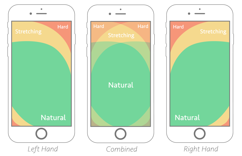
Understand how users interact with their phone and place the relevant information and buttons in the right place to improve ease of use. As you can see in the image below, most users user their right hand when holding a phone while scrolling with their right thumb. With this in mind, here is an example – Placing buttons close to the bottom right corner, closest to the thumb, in the shopping experience to increase conversions to the cart.

If you would like some more advice or to talk about an upcoming project you have feel free to reach out to us [email protected].


