Dark UX Patterns in e-commerce and examples of good alternatives

All of us experienced it, sometimes even without knowing. Dark UX patterns lead to users being manipulated into taking a certain action (usually it’s all about spending money) without knowing that they had a choice or being forced to make a specific one. These patterns are always intentional, and therefore unethical.

Let’s look at them one by one…

‘Surprise’ prices on a checkout step

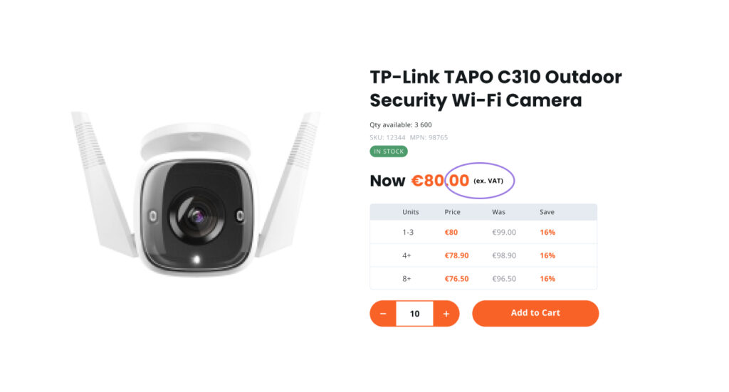
Not being informed about any additional costs like service fees or added tax can be at least disappointing.

First of all, this can increase the cart abandonment ratio, since people will see that the final price is different from what they were expecting.

Also, there’s a chance that people will simply miss ‘additional cost’ info on the checkout. Some people can press ‘pay’ and then call your support line irritated about the amount that has been charged from their card.

Clients’ loyalty should be a priority for any business, so we recommend showing additional costs upfront.

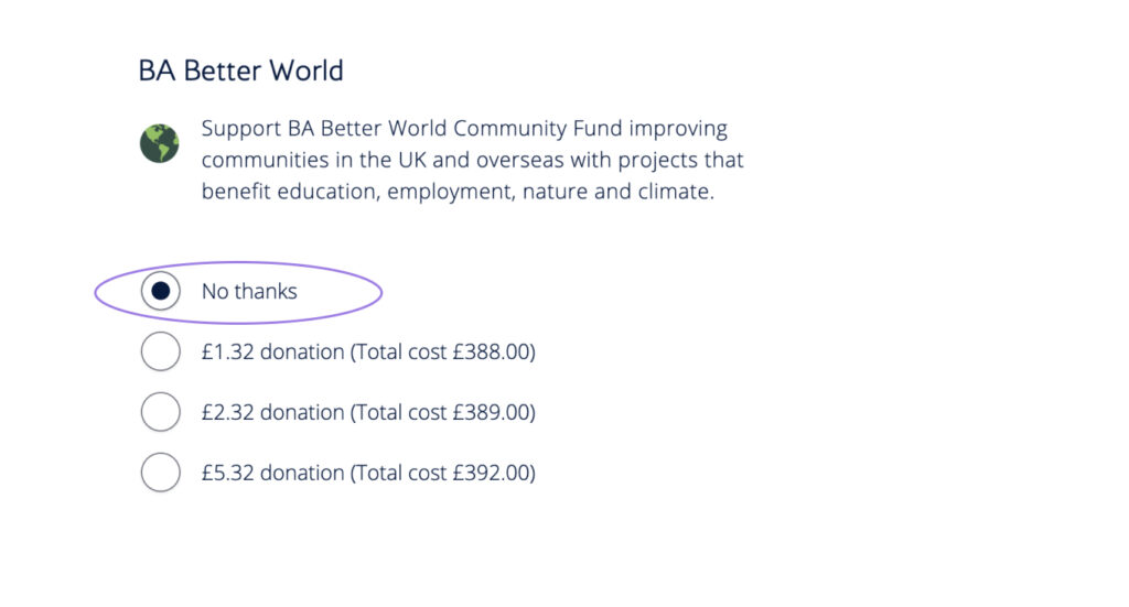
See the example below from CMS Distribution where the user is made aware of the VAT implications.

‘Get it for free’ deals

If your business is providing any type of free product or service that will require a person’s credit card or personal information to be shared before they can get it, then users should be informed about it before clicking ‘Get it for free’.

One of the ways could be to show the price that the user will be paying after the trial period ends. 

The example below is from Apple Music where the costs are upfront and displayed once the free trial finishes.

Hidden cancellation

If a user is determined to cancel the service, hidden cancellation won’t save businesses from losing them, it will only increase the user’s frustration. Cancellation should be available somewhere in the account management area.

Good practice can be asking users about the reason they are leaving and offering them a discount.

Below are examples from Butternut Box.

Confirmshaming

The goal of this dark UX pattern is to get the user to opt into doing something, by making the alternative choice sound undesirable. A good example of it is offering a discount on a user’s first order in exchange for their email address, and if the user doesn’t want to share their email address, they have to click on an option that says something like, “No thank you, I don’t like saving money.”

We recommend giving people a choice and using shame-free wording in all your marketing endeavors.

GQ Magazine uses simple and descriptive labels, see example below.


Tricky checkbox

There are some checkbox questions that appear to ask one thing, but if read carefully, they ask another thing entirely, sometimes the opposite.

Usually, you have to tick the checkbox if you want to receive email notifications. Although now we can see a popular dark UX practice when you have to tick a checkbox in order to NOT receive spam emails.

We recommend making these messages clear and simple, like “I want to receive email notifications’.

Image from Welcome to Bratislava website

Playing on Fear of Missing Out

‘This sale ends in 2 hours, hurry up!’, ‘Only 3 items left in stock’, and so on. 

Pressuring users to make a quick buying decision may feel like a good idea, but quite often these messages make the shopping process stressful and the last thing you want is for people to associate your website with stress. Also, we all quite often regret our impulsive purchases, which increases the risk of product returns.

We recommend using emotionally neutral messages – so instead of ‘Only 3 left in stock’ you can simply write ‘3 left in stock’. Small change, but feels different, doesn’t it?

Image from WordPress forum (Product stock quantity)

Sneak into Basket

Somewhere along the purchasing journey, the site sneaks an additional item into your basket, often through the use of an opt-out radio button or checkbox on a previous page. Quite often budget airlines are guilty of doing that – through pushing seat reservation, flight insurance and other services.

If you still would like to offer those services and will use the radio button approach, at least make the free option selected by default.

Images below from British Airways website.

Let’s keep our users informed, in control and respected at all times. Let us know if you have any questions.

—-

Monsoon Consulting are Ireland’s only Adobe Gold Solution Partner, focusing on delivering best in class B2B and B2C eCommerce solutions to large companies such as Uniphar PLC, Sysco (Pallas Foods), Topline, Heat Merchants Group, One4All and Central Bank of Ireland.

The team at Monsoon provide a full-service offering from business consultancy & strategic planning, UX & UI creative design, development & engineering, Infra & Dev ops to a dedicated Support team, offering 24×7 critical application support.

For more information on how Monsoon Consulting can help your business online, please get in touch with [email protected] or call +353 (0)1 4750066

With us you'll get customised digital solutions. B2B eCommerce expertise. eye-catching UX & design. streamlined on-boarding. a high-performance site. a long-term partnership. a thorough discovery. white-glove support. an amazing website. a team of experts.

Ready to transform your site?

Get in touch today!

EMPOWERING     INNOVATIVE     HUMBLE     SOLUTION-ORIENTED     EFFICIENT    HONEST     ARTISTIC     RESPONSIBLE     INNOVATIVE     CUSTOMER-CENTRIC     AWARD-WINNING   

EMPOWERING     INNOVATIVE     HUMBLE     SOLUTION-ORIENTED     EFFICIENT    HONEST     ARTISTIC     RESPONSIBLE     INNOVATIVE     CUSTOMER-CENTRIC     AWARD-WINNING