UI Tips for using Page Builder Successfully
Adobe Commerce (previously known as Magento) is a powerful tool for eCommerce, and its Page builder tool continues this legacy. But wait, what is Page Builder? Page Builder is a powerful content creation tool that allows you, the merchant, to create best-in-class shopping experiences without the need for support from developers. This means that you can update and iterate on your B2B or B2C eCommerce platform with greater ease. However, the flexibility it offers can easily cause you to stray away from a consistent brand in terms of its visual aesthetic and tone of voice. This lack of consistency can affect your platform’s professional appearance and cause your users to negatively perceive your brand. But don’t worry, with a few simple considerations you can ensure your brand remains consistent regardless of how many updates and alterations you make to pages through page builder.
Your typeface matters
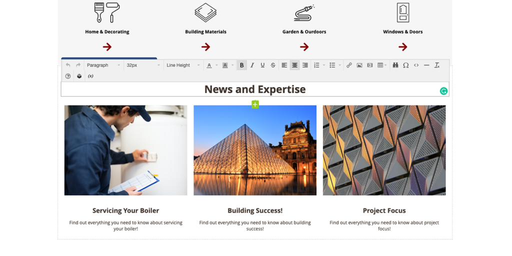
Designers can spend quite a bit of time choosing the right typeface for your brand. Each typeface offers its own unique quirks, history, associations, and personality. Rounded typefaces denote playfulness and friendliness, whereas the likes of more classical serif typefaces can denote history and extravagance. Some typefaces are great for use as headings, as they offer impact while portraying values that the brand resonates with; however, when used at smaller sizes for extended periods – such as body text – they can become difficult to read and irksome. Designers take all of these into account when choosing the right typeface for your brand, and the styles that best suit them. If you have had a designer do that for your brand (and they did so with your digital platform in mind) then do yourself a favour and stick with these styles. A telltale sign that a page or section of a site was not done by a designer is that the styles are no longer used consistently, and often a new typeface appears. If you are using a Page Builder tool, ensure you look at how the style, sizing, and weight of the typeface is used and attempt to follow those rules. If you don’t have one, a style guide can be of great use (more on those later).

Use colour responsibly
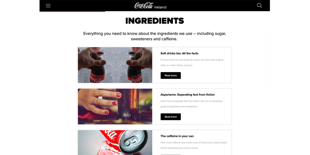
Most brands have a main colour that helps to denote and identify them from their competitors. For example, if we think of Coca-Cola we think of their vibrant red. But if you took a look at their website you’d notice that they dial back their use of this colour. Despite it being a brand signature, they understand that it’s impact is in drawing the eye and capturing users’ attention. This can’t be done if they use it everywhere on their site. Instead, they choose what is important on the page and highlight it with the use of their red. Keep this in mind when using colour on your pages. You may feel that your brand image is lacking on that page, but your brand should be more than a colour. The style of imagery, icons, the tone of voice in your text all helps to showcase your brand. Your main colour should only be an addition to this, it should not be the brand.

Not everything can be the main character
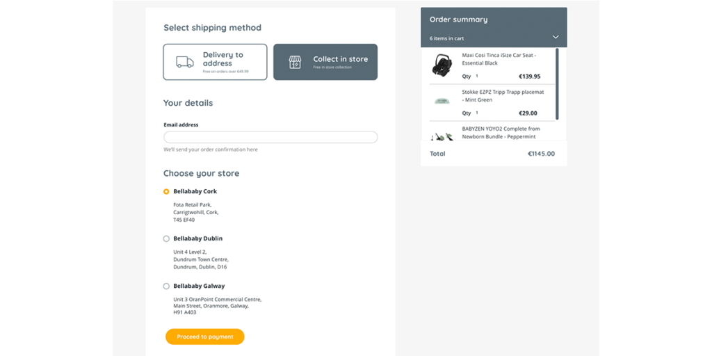
As I started to touch on in my last point, not everything on your page is of equal importance. More importantly, not everything can be of equal importance. Your page has a goal, which may be to sell products, but as part of this goal, you have to be able to sell your users the products. This becomes quite a challenge when everything on your page is fighting for attention. For example, if every button your page uses is your company’s main colour, then it becomes a challenge to differentiate the ‘load more’ button from the ‘buy now’ button, and what would you rather the user click on? By using a hierarchy within the page both in the layout and in the styles used, users can better differentiate each section and the main aim of those sections.

Consider having a style guide
I touched on this at the end of my first point, but what did I mean? A style guide in the context of a digital platform is essentially a list of standards, components, and styles to help dictate the design, format, and visual tone of a platform. What do they include? A style guide often would include text styles, which are a list of various heading and body text styles so that there can be a consistent use of styles and a consistent hierarchy throughout the site. This way the body text of one page is not different from the body text of another page. Having a style guide also helps take out the guesswork in the design process and means you can pay attention to what content you want to use when in page builder, rather than having to focus on how to make it look good.
Page builder tools offer a fantastic level of flexibility and provide merchants with an increased level of ownership and autonomy. But to produce a good, consistent user experience it’s important to ensure that the UI you apply is meeting your platform’s standards, and not negatively sticking out. If you spent the money having designers create the platform’s visuals, and consider how these work in terms of accessibility and your business needs, then why ignore them?
By considering the above principles, and applying them to your use of page builder tools, you will be better able to ensure that your eCommerce platform remains consistent and your brand isn’t diluted.
If you want to learn more about how Pagebuilder and Adobe commerce can help your eCommerce platform then get in touch with our team at [email protected] or call us on +353 (0)1 4750066


